
It's a good graph. It's not intended for a casual look, you were supposed to see it first in May or something and be watching it progress ever since.
The R breaks are simple. Right hand axis. R=3 pre March lockdown, then R=0.7 in lockdown, then R=1 when unlocked in July, then upwards a bit with the salami slice-by-slice unlockdown in August, then up to R=1.4 in Sept with schools/unis. R dipping down again in Dec/Jan is due to burn out at herd immunity levels.
You don't need to look at the light green and cyan, that's just model ranges. The little red circles come together to show a clear red line. We know the lags mean the next month's figures are baked in. The path of red circles is the story.
All it needs is the addition of dotted horizontal lines to show the left axis - pretty hard with log scales to picture where 500 deaths a day lie.
On the technical bit, I think he said once that the number of deaths error range was a back of the envelope that he doesn't care about. It would be more useful for him to show a November forecast with ranges. He doesn't care about the low stuff during the summer lull either - that's just noisy stats. It's intended for the big curves up and down in the hundreds of deaths a day periods, not precision when deaths are a handful a day.
COVID-19
Re: COVID-19
 Awarded gold star 4 November 2021
-
Bird on a Fire

- Princess POW
- Posts: 10137
- Joined: Fri Oct 11, 2019 5:05 pm
- Location: Portugal
Re: COVID-19
I'm pretty sure he's just using the default palette in R, which has actually just been updated for version ≥4 https://developer.r-project.org/Blog/pu ... index.html
We have the right to a clean, healthy, sustainable environment.
Re: COVID-19
It's cluttered. Clutter makes plots difficult to interpret. And yes, I would have made the same statement back in April/May or when it was first drawn. Stacking the deaths (and model) and the Reff in different panels, with the same x-axis would be better.
The defaults in R (v.<4) are terrible, including the default plot symbol, which is an open circle.Bird on a Fire wrote: ↑Tue Oct 27, 2020 12:35 pmI'm pretty sure he's just using the default palette in R, which has actually just been updated for version ≥4 https://developer.r-project.org/Blog/pu ... index.html
Re: COVID-19
There have been plenty of pretty charts from the govt, Sage, others - only problem is they've been sh.t at predicting. What's the point in getting the colours beautiful if you're showing R<1 but cases rising remorselessly?
Awarded gold star 4 November 2021Re: COVID-19
As I said, I was possibly arguing the wrong thing, but presenting data clearly *is* important.
-
Bird on a Fire
- Princess POW
- Posts: 10137
- Joined: Fri Oct 11, 2019 5:05 pm
- Location: Portugal
Re: COVID-19
I've gotta say that I like the open circle, and often switch other graphics packages (eg ggplot) to use it - it's much clearer than a filled shape when you have overlapping data points, and in my head crosses indicate uncertainty.geejaytee wrote: ↑Tue Oct 27, 2020 1:01 pmThe defaults in R (v.<4) are terrible, including the default plot symbol, which is an open circle.Bird on a Fire wrote: ↑Tue Oct 27, 2020 12:35 pmI'm pretty sure he's just using the default palette in R, which has actually just been updated for version ≥4 https://developer.r-project.org/Blog/pu ... index.html
What's the argument against open circles? In the interests of improving my own plotting, rather than criticising Annan's
We have the right to a clean, healthy, sustainable environment.
Re: COVID-19
Mine would be that the relative default size is a bit too big, but then I do plot hundreds or thousands of points on the same scatter, so it gets messy very quicklyBird on a Fire wrote: ↑Tue Oct 27, 2020 3:03 pmI've gotta say that I like the open circle, and often switch other graphics packages (eg ggplot) to use it - it's much clearer than a filled shape when you have overlapping data points, and in my head crosses indicate uncertainty.geejaytee wrote: ↑Tue Oct 27, 2020 1:01 pmThe defaults in R (v.<4) are terrible, including the default plot symbol, which is an open circle.Bird on a Fire wrote: ↑Tue Oct 27, 2020 12:35 pm
I'm pretty sure he's just using the default palette in R, which has actually just been updated for version ≥4 https://developer.r-project.org/Blog/pu ... index.html
What's the argument against open circles? In the interests of improving my own plotting, rather than criticising Annan's
Re: COVID-19
All plots should be exported to Illustrator (or whatever the free version is called) and fiddled with there to make them look nice.
I prefer solid markers to line based. e.g. open circles make a plot seem messy and confusing if there's too many of them, and if the plot ends up being small on the page they are not as clear as something smaller and solid. I also find it odd when you don't have some ink where the actual data point is, but that might just be me. If there's lots of overlap, you can add a black border to them, do some transparency, or both which helps. If there's a crap load of data, sometimes a 2D histogram is best, with a sensible colormap, but not when you want to compare the data to a line, like the above (but I wouldn't call that a crapload either).
(There's no correct way 'cos it depends what you're doing and what you want to show, but there's definitely better ways than others for each situation)
Re: COVID-19
Presentation style depends on the intended audience too. Presumably his readers will get the axes right with a moment's thought, rather than thinking R-eff hit 1000 in April, while deaths/day reached around 3.
-
Woodchopper

- Princess POW
- Posts: 7078
- Joined: Sat Oct 12, 2019 9:05 am
Re: COVID-19
Good thread on the situation in France
https://twitter.com/jeuasommenulle/stat ... 58816?s=21
https://twitter.com/jeuasommenulle/stat ... 58816?s=21

Re: COVID-19
The most I've plotted on an x-y graph was 4-million datapoints.monkey wrote: ↑Tue Oct 27, 2020 3:41 pmAll plots should be exported to Illustrator (or whatever the free version is called) and fiddled with there to make them look nice.
I prefer solid markers to line based. e.g. open circles make a plot seem messy and confusing if there's too many of them, and if the plot ends up being small on the page they are not as clear as something smaller and solid. I also find it odd when you don't have some ink where the actual data point is, but that might just be me. If there's lots of overlap, you can add a black border to them, do some transparency, or both which helps. If there's a crap load of data, sometimes a 2D histogram is best, with a sensible colormap, but not when you want to compare the data to a line, like the above (but I wouldn't call that a crapload either).
(There's no correct way 'cos it depends what you're doing and what you want to show, but there's definitely better ways than others for each situation)
I was quite pleased because I identified 5 devices that had been mistested out of them.
As we are only dealing with one datapoint per day here - why is there such an aversion to gridlines? That's a general observation, not just here.
I quite like my version of the ECDC data which I think is fairly clear and shows the daily variation as well as the trend:
So my forecast for the next 4-weeks (because I've not seen the cases slow down appreciably) is simply use a ruler and continue that trend, which I make about 500-800 per day by November-12th
Have you considered stupidity as an explanation
Re: COVID-19
4 Million is a crapload.
I don't mind gridlines, they're not always needed, but they're especially useful for log plots when the audience might not be familiar with them.
I like your graphs, they do the job without confusing you. They'd look nicer if you messed around with them in Illustrator though (I do realize that this might not be worth the effort in this case).
I don't mind gridlines, they're not always needed, but they're especially useful for log plots when the audience might not be familiar with them.
I like your graphs, they do the job without confusing you. They'd look nicer if you messed around with them in Illustrator though
-
Woodchopper
- Princess POW
- Posts: 7078
- Joined: Sat Oct 12, 2019 9:05 am
Re: COVID-19
Up to 367 this Tuesday. If the trend holds it’ll be topping 500 in a week.Woodchopper wrote: ↑Tue Oct 20, 2020 7:59 pm241 UK deaths announced today. Probably included some from the weekend, but still it’s a bad number.
If it keeps up its just over two doublings to get to 1000 per day.
Re: COVID-19
Yes, I was particularly pleased with that.monkey wrote: ↑Tue Oct 27, 2020 10:06 pm4 Million is a crapload.
I don't mind gridlines, they're not always needed, but they're especially useful for log plots when the audience might not be familiar with them.
I like your graphs, they do the job without confusing you. They'd look nicer if you messed around with them in Illustrator though
Our customers have PPB lifetime (10 years is standard, if I remember correctly) failure rate requirements and we produce enough parts that that is a meaningful statistic
But putting the graph into Illustrator, rather than simply selecting the dropdown for the UK and copying the graph into Twitter, sounds like a bit of work.
As for my graphs there are so many bad examples I've seen . But the lagging 7 day moving average is one that I find discombobulating
Have you considered stupidity as an explanation

Re: COVID-19
If you need to edit a graph in Illustrator, you either need better plotting software or to learn to use the software you have.monkey wrote: ↑Tue Oct 27, 2020 10:06 pm4 Million is a crapload.
I don't mind gridlines, they're not always needed, but they're especially useful for log plots when the audience might not be familiar with them.
I like your graphs, they do the job without confusing you. They'd look nicer if you messed around with them in Illustrator though
briefly Stephanie's favourite user
-
El Pollo Diablo

- Stummy Beige
- Posts: 3328
- Joined: Wed Sep 25, 2019 4:41 pm
- Location: FBPE
Re: COVID-19
- Daily Covid deaths weekly moving average since 1st Sept.png (25.56 KiB) Viewed 2826 times
We'll be at 1,000 deaths a day (MWA) by the 19th November at this rate - sooner, in reality, because we're on the upward part of the lognormal time series and so reporting is lagging deaths.
And 25,000 people in hospital won't be reached by "the end of November", but by the 12th/13th November, at the current doubling rate (13 days).
- Covid UK Hospital Patient Numbers since 1_9_2020 (1).png (26.07 KiB) Viewed 2826 times
If truth is many-sided, mendacity is many-tongued
-
discovolante

- Stummy Beige
- Posts: 4099
- Joined: Fri Oct 11, 2019 5:10 pm
Re: COVID-19
Really, what we should all do, is try and catch it as soon as possible in case we need a hospital bed, before they're all taken up. Sort of like a high stakes El Farol Bar problem.
To defy the laws of tradition is a crusade only of the brave.
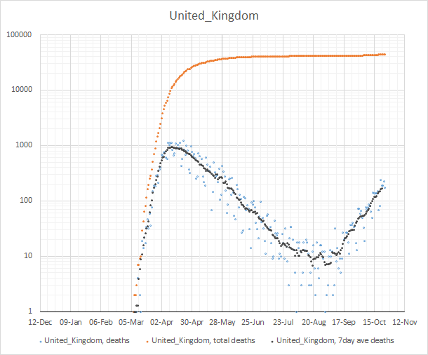
Re: COVID-19
Nice charts, EPD and jimbob.
But where is the impact of shutting pubs at 10? This measure must have had a dramatic effect, knocking the curves downwards. Yet you show nothing. What have you done wrong?
But where is the impact of shutting pubs at 10? This measure must have had a dramatic effect, knocking the curves downwards. Yet you show nothing. What have you done wrong?
Awarded gold star 4 November 2021Re: COVID-19
It's a real puzzler LPM.
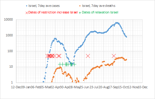
Here's yesterday's data for Israel with rather untidy dates of restrictions easing (green plusses) or increasing (red X) added in.
It looks as though their current lockdown is reducing the cases now, but it's too soon to see the deaths start to fall convincingly yet
Have you considered stupidity as an explanation
-
Bird on a Fire
- Princess POW
- Posts: 10137
- Joined: Fri Oct 11, 2019 5:05 pm
- Location: Portugal
Re: COVID-19
What time do the pubs shut in Israel?
We have the right to a clean, healthy, sustainable environment.

-
Bird on a Fire
- Princess POW
- Posts: 10137
- Joined: Fri Oct 11, 2019 5:05 pm
- Location: Portugal
Re: COVID-19
That'd do it.
Clearly the UK just needs to tweak closing time a bit earlier. Like, six weeks earlier.
Clearly the UK just needs to tweak closing time a bit earlier. Like, six weeks earlier.
We have the right to a clean, healthy, sustainable environment.
-
sTeamTraen

- After Pie
- Posts: 2558
- Joined: Mon Nov 11, 2019 4:24 pm
- Location: Palma de Mallorca, Spain
Re: COVID-19
ICU capacity to treat COVID-19 patients in Belgium effectively ran out today. 
It turns out that when you read about total ICU capacity, that assumes that the usual mix of illnesses applies. It breaks down when they all need the same equipment.
The number of people in ICU with COVID-19 is about 900, and in theory they have 2000 beds if (a) field hospitals are included, (b) everybody else in the country can be persuaded to not have a heart attack or brain haemorrhage until April next year, and (c) the rate of staff sickness falls from its current 15% to zero. But today they had their first death because they didn't have enough heart-lung bypass machines available in the hospital in question.
Something something hammer something something nail
-
mediocrity511

- Snowbonk
- Posts: 409
- Joined: Mon Nov 11, 2019 2:16 pm
Re: COVID-19
Is it referring to ECMO? Because I'm fairly certain the UK only has a handful of beds capable of that too.sTeamTraen wrote: ↑Wed Oct 28, 2020 6:01 pmICU capacity to treat COVID-19 patients in Belgium effectively ran out today.
It turns out that when you read about total ICU capacity, that assumes that the usual mix of illnesses applies. It breaks down when they all need the same equipment.
The number of people in ICU with COVID-19 is about 900, and in theory they have 2000 beds if (a) field hospitals are included, (b) everybody else in the country can be persuaded to not have a heart attack or brain haemorrhage until April next year, and (c) the rate of staff sickness falls from its current 15% to zero. But today they had their first death because they didn't have enough heart-lung bypass machines available in the hospital in question.
-
sTeamTraen
- After Pie
- Posts: 2558
- Joined: Mon Nov 11, 2019 4:24 pm
- Location: Palma de Mallorca, Spain
Re: COVID-19
I think the two are different: https://www.medscape.com/answers/181861 ... ary-bypassmediocrity511 wrote: ↑Wed Oct 28, 2020 7:45 pmIs it referring to ECMO? Because I'm fairly certain the UK only has a handful of beds capable of that too.sTeamTraen wrote: ↑Wed Oct 28, 2020 6:01 pmICU capacity to treat COVID-19 patients in Belgium effectively ran out today.
It turns out that when you read about total ICU capacity, that assumes that the usual mix of illnesses applies. It breaks down when they all need the same equipment.
The number of people in ICU with COVID-19 is about 900, and in theory they have 2000 beds if (a) field hospitals are included, (b) everybody else in the country can be persuaded to not have a heart attack or brain haemorrhage until April next year, and (c) the rate of staff sickness falls from its current 15% to zero. But today they had their first death because they didn't have enough heart-lung bypass machines available in the hospital in question.
Something something hammer something something nail