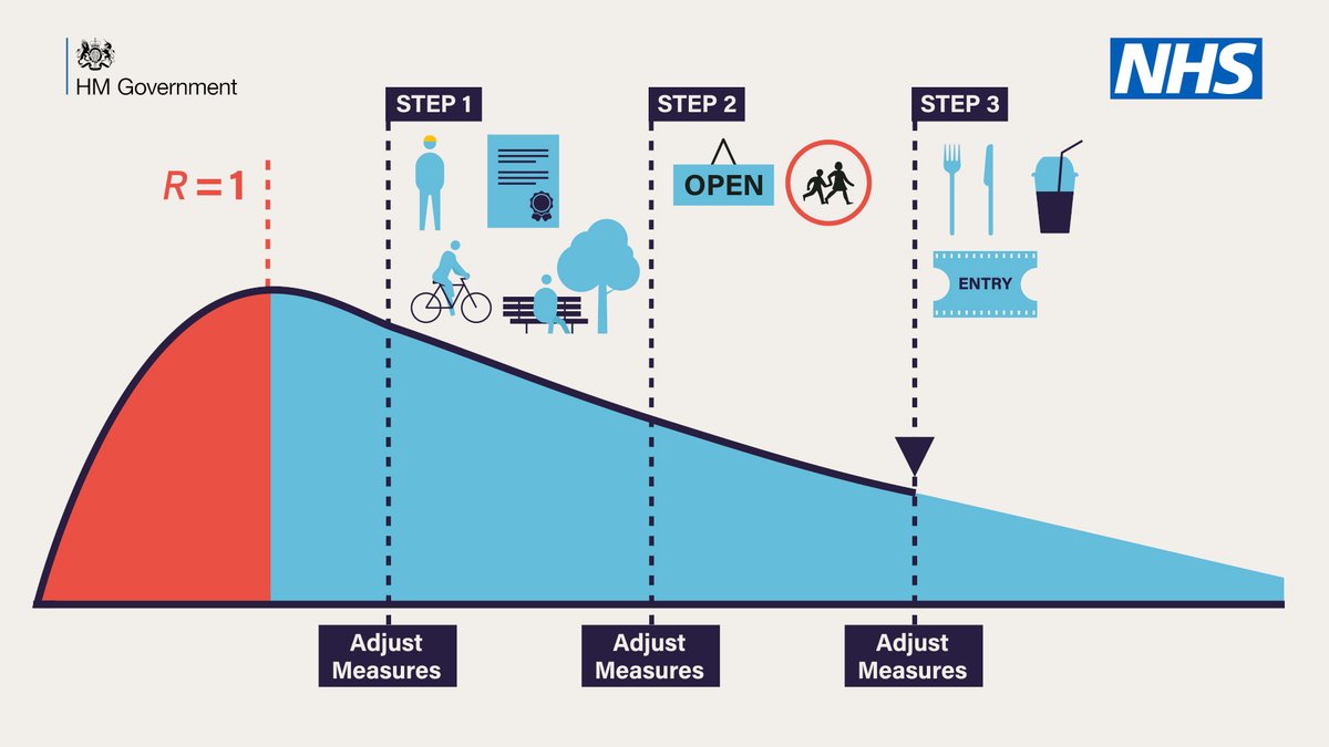
If you missed the Prime Minister's speech, Step 1 is now. Step 2 is 1 June and Step 3 is 1 July - conditional on success in the coming weeks.
The Y-axis wasn't specified, but is presumably average new infections per day. A bit confusing, but the red section would be from when R was >1, leading to the growth, then lockdown and R has been <1 in the blue zone.
The downwards slope would be consistent with R remaining steady at, say, 0.8. Still new cases every day, but declining.
Of course, Step 1, Step 2 and Step 3 will change R. The whole point of unlockdown is you open shops, schools, restaurants, cinemas and cafes, as shown by the pretty little icons.
Keeping R steady at 0.8 while unlocking things obviously isn't going to happen. The chart cannot possibly be true.
And it's an easy thing to compare against reality. "Prime Minister, you presented this graph with cases steadily declining. But here's the actual path. What went wrong?"