Bad Graphs
Posted: Thu Nov 26, 2020 8:49 am
I thought we had a topic for this, but spotted by a friend on Twitter, who described the scale s as "novel"
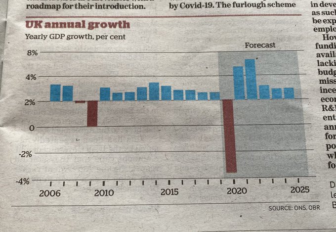
It seems to me that the only thing wrong with the bad graph was the numbers along the vertical scale. Those numbers were so catastrophically bad that it looked like several errors (the baseline of the bars not being at zero, irregular step sizes along the vertical axis), and invalidated the whole graph of course. But I don't see anything else wrong - the 2006 on the x axis seems a bit weird, but it is located at the correct tickmark (the original graph in the BBC article has 2005 at the larger tickmark but no bar above it, the data starts at 2006).El Pollo Diablo wrote: Thu Nov 26, 2020 2:09 pm So the scale was wrong in the OP as well (the bars should've been every 4 points, rather than every two), which is amazing. Good effort. I'd say it's easier to do it right than to do it this badly.
The x-axis is definitely the "jaywalking" part of that "murder, arson and jaywalking" graph but nevertheless it still isn't good practice.jaap wrote: Thu Nov 26, 2020 2:40 pmIt seems to me that the only thing wrong with the bad graph was the numbers along the vertical scale. Those numbers were so catastrophically bad that it looked like several errors (the baseline of the bars not being at zero, irregular step sizes along the vertical axis), and invalidated the whole graph of course. But I don't see anything else wrong - the 2006 on the x axis seems a bit weird, but it is located at the correct tickmark (the original graph in the BBC article has 2005 at the larger tickmark but no bar above it, the data starts at 2006).El Pollo Diablo wrote: Thu Nov 26, 2020 2:09 pm So the scale was wrong in the OP as well (the bars should've been every 4 points, rather than every two), which is amazing. Good effort. I'd say it's easier to do it right than to do it this badly.
I'd take issue with two other aspects. Firstly, it's about GDP which is a fairly bogus statistic in the first place - if I buy a coffee at a cafe that counts as part of the nations productivity, but if I make the same coffee at home it doesn't. And secondly it is a sequence of growth percentages presented as if that's meaningful. Specifically, a sequence of 5% growth, -5% growth looks like each of the 5% and -5% mean the same thing, but they are percentages of different things. 5% growth followed by -5% growth is not 0% but -0.25%. Rather than showing percentage growth, the graph show show actual GDP. That would make it easy to see when a recovery from a dip actually ends.jaap wrote: Thu Nov 26, 2020 2:40 pm It seems to me that the only thing wrong with the bad graph was the numbers along the vertical scale.
percentages vs percentage points - the classic one.El Pollo Diablo wrote: Fri Nov 27, 2020 7:22 am I had a related argument recently with an innumerate misogynist, who was claiming that a 20% rise in the number of women working for my employer (which is 80% male) meant a 20% drop in the number of men.
Neil O'Brien wrote:While everything should be questioned (that's what science is), some of the papers need to apply the same standards to covid-denial content from random people with cartoon avatars that they do to the real scientists and clinicians on SAGE.
From the Pandemic Arena :snoozeofreason wrote: Fri Nov 27, 2020 11:26 am I don't imagine it's often that one would get to say this, but here is a bad graph eloquently corrected by a Tory MP on twitter.
tweet_smaller.png
tweet2.png
I appears that the "Statistics Guy" who produced the original had massaged the figures downwards by assuming that the population of the UK had increased by 6.8% in a year and then "correcting" for that fictional increase.
Neil O'Brien wrote:While everything should be questioned (that's what science is), some of the papers need to apply the same standards to covid-denial content from random people with cartoon avatars that they do to the real scientists and clinicians on SAGE.
Gordon has been very productive in this.Gordon L wrote: Sun Nov 22, 2020 2:27 pm The back-story to this:
The Daily Mail used a graph by a "Twitterer" called "The Statistics Guy" @Jon_statistics
On one of his conspiratorial threads, 2 weeks ago, I posted this:
https://twitter.com/gordonrlove1/status ... 22657?s=19
"[Excess deaths in England &Wales are] over 10% up on the standard seasonal thing" (I was quoting the ONS figures for week 43)
He told me that my figures were a rookie mistake, as I had not
accounted for population-growth
He then "corrected" me, using figures adjusted in a way that, to this day, I cannot work out.
I then published a population-normalised version, & pointed out how it looked as you'd expect such a thing to look
I waited a day, pointed out more explicitly how his looked quite different, and asked him to explain his version.... and he blocked me
Then the other day, someone pointed out that his week 44 version of the same graph was being used to discredit the lockdown
Over the past 5 years, the population has grown, up to 2.7%
He has upped the historic data by 6.98%
Coincidentally, that makes the current year and his version of the historic data look the same
He then manages to graph it so the current actual very slightly larger number, looks very slightly smaller than his bizarrely wrong adjusted historic figure looks
with this in the thread below:It's also worth noting that his previous account was banned by Twitter, which means he's not allowed to operate this new account.


there was a topic for this :( viewtopic.php?f=8&t=1191jimbob wrote: Thu Nov 26, 2020 8:49 am I thought we had a topic for this, but spotted by a friend on Twitter, who described the scale s as "novel"
That was the one... I knew I'd seen it.Stephanie wrote: Fri Nov 27, 2020 4:36 pmthere was a topic for thisjimbob wrote: Thu Nov 26, 2020 8:49 am I thought we had a topic for this, but spotted by a friend on Twitter, who described the scale s as "novel"
viewtopic.php?f=8&t=1191
The x axis is fine by itself - labels are every 2 days but there are points every day. There just isn't enough space to label every point. And I'm not that bothered about the fact that they're comparing with a week ago as you can click on the graph and then select to view just the last week or month or whatever - so the week on week figure and the graph are just 2 headline things that you can delve further into. No idea what the blithering wotsit is going on on the y axis though (it is every 96/5, not every 6/5, though).shpalman wrote: Thu Dec 10, 2020 6:05 pm
What the f.ck is this? Labelling the x-axis every two days while talking about weeks, and the y-axis seems to be every 6, except for one interval which is only five. f.ck's sake.
There’s a Dara clip for that.Gfamily wrote: Sun Jul 18, 2021 9:41 pm Is there a surge in violent crime? Who knows.
This chart is just the number of people (in the poll) who expressed that as an opinion.